Frequently asked questions (FAQ)
- What exactly is a re-emerging disease?
- What is the scope of RED Alert?
- How is the spline calculated?
- How is “re-emergence” determined?
- What is the preformance of re-emergence classifiers?
- What is the difference between "Unable to calculate re-emergence" and "Likely not re-emergence" in the Disease Incidence Trend Analysis graphic?
- Graphics are displaying no data, what does this mean?
- Why do some graphics appear blank, or have no data?
- What information is in the re-emergence factors?
- What information does the “Indicator Analysis” graphic convey?
- What information does the “Global Comparison of Indicators” graphic convey?
- Does the exact location of the re-emergence dot on the map indicate a specific area within a country where the event occurred?
- A data source link is broken. How can I access the original data source?
- Can I access the data used here?
- Why are there multiple population sources with different values?
- Why are there multiple case count sources?
- Why do the data you display not include all values from the data source?
What exactly is a re-emerging disease?
The term "re-emerging infectious disease" is not defined consistently in the literature. However, various verbal definitions of the term are related in that they explain a disease with any known historical occurrence, a decrease in occurrence, followed by a more recent increase. "Re-emergence" instances are only defined as such when subjective and non-reproducible assessments are made, usually by public health experts who report/publish details of infectious disease events in peer-reviewed literature. Here, we seek to provide insight into potential re-emerging disease scenarios by providing a set of informative visuals and analytics that enable user assessments to be based on a more standardized set of criteria.
What is the scope of RED Alert?
How is the spline calculated?
The spline is calculated using SciPy's univariate spline method. We use the default parameters except for s, the smoothing factor. We use a smoothing factor
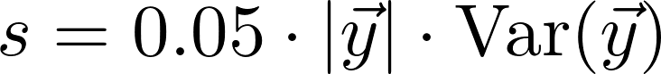 where y is the vector of values. s is therefore a fraction of the length of the data times the variance of the data.
How is “re-emergence” determined?
Potential re-emergence is detected using a machine learning classifier—algorithms that learn a decision function that maps a new observation to a class (from a set of classes, e.g., spam vs. non-spam email) based on the given labeled data (known observation-class pairs, e.g., examples of spam and non-spam emails).
For creating the labeled dataset for each disease, the subject matter experts (SMEs) in our team were given data for 100 countries selected at random and they labeled each location-year pair as a re-emergence or not. For measles and cholera, the disease trend before and after year 2000 seem quite different and hence, the labeling and classification is performed only on the data starting from 2000. On the other hand, there is a lot of missing data for dengue after 2000, so this is done for a longer time frame (starting 1980). For each disease, SMEs developed a schema that takes into account factors (e.g., raw incidence, case counts, change in incidence, etc.) that help detect potential re-emergence and help guide the labeling process.
These labeled datasets were used to train classifiers for various diseases. We tried two classifiers: decision tree and random forest. For all diseases, random forest performed better than decision tree and hence RED Alert uses random forest to detect if there is a re-emergence for the given disease in a given location and year.
What is the preformance of re-emergence classifiers?
We performed nested cross-validation (where inner cross-validation is used to select optimal parameters and outer cross-validation is used to test for overfitting) 10 times. The results (i.e., mean and standard deviation across 10 nested cross-validations) are as follows:
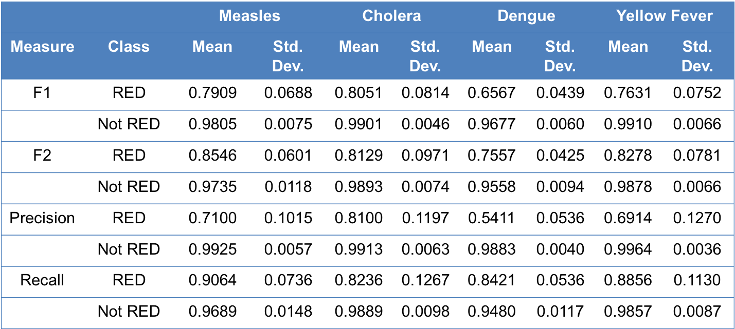
Information about various performance measures can be found here.
What is the difference between "Unable to calculate re-emergence" and "Likely not re-emergence" in the Disease Incidence Trend Analysis graphic?
Either of these indications can appear for the user’s input value, which will appear as the last point on the graph. These two indications are meant to inform the user whether or not their case count input for the year of interest represents an instance for which the classifier was able to assess it, or whether or not there was insufficient data to compute whether or not the given information represents a re-emergence. For example, in the case of cholera, if the majority of historic case counts is missing from the data (curated directly from the data source selected in the input section) for the previous five or three years, or if the previous year data is missing, then a re-emergence cannot be calculated. If there are sufficient data, but disease metrics are low enough not to warrant a re-emergence, then a note indicated that it is not a re-emergence event will appear instead.
Graphics are displaying no data, what does this mean?
When a message appears, indicating that there are no data to display, this is a result of missing data in the data source you selected. For example, if you have selected “Yellow Fever,” “Russia,” and “2016” as the disease, location, and year of interest, respectively, there are no data for these queries as reported by the data source (World Health Organization, for example), so no information will populate in the map or boxplot in the “Historic/Global Analysis” tab. This is not a bug with the tool, but rather a reflection of a lack of data reported from the data source selected.
Why do some graphics appear blank, or have no data?
This can occur for a multitude of reasons.
In the case of the box plots, the second graphic on tab two, there may be instances in which only one country appears. While this feature is meant to allow a user to compare their country of interest with ‘related’ countries (as specified in the help text link directly under the graph), only one country will appear if no other locations for that year of interest had incidences within the 50-150% range of the user’s location of interest.
In the case of the global incidence map, the first graph on tab three, the map will default to the last year for which we have any global data. For example, if a user selects the current year in the original input pane on the left-hand side of the tool, this map may default to the previous year (or other years, depending on the data source selected). This is because we only procure annual data for our sources, which is only available several months after the conclusion of the calendar year.
What information is in the re-emergence factors?
Multiple component causes are necessary to produce a disease outbreak or a re-emergence event. These events occur from a variety of different pathways. This visualization supplies a list of components that are meant to develop hypothesis for sufficient causes in a re-emergence scenario. Not all factors are causal to the user's situation, however each of the nodes have been identified through a literature review as contributing to a disease-specific historical disease outbreak or re-emergence event. The broad categories of host, pathogen, and environment in the center of the wheel fit the epidemiological triad. With increasing distance from the center, the contributing causes become more specific. The outermost layers, or primary indicators, are designed to provide the user with the most actionable factors that can potentially prevent re-emergence on a specific pathway.
What information does the “Indicator Analysis” graphic convey?
This chart shows the association between the variable selected in the dropdown with respect to time and incidence. Here, the location of the point on the y axis shows the variable value, the location of the point on the x axis shows the year, and the size of the bubble corresponds to the incidence (per 100,000 persons). Please refer hover text for point-by-point information.
What information does the “Global Comparison of Indicators” graphic convey?
This chart shows the association between the variable selected in the dropdown with respect to time and incidence. Here, the location of the point on the y axis shows the variable value, the location of the point on the x axis shows the year, and the size of the bubble corresponds to the incidence (per 100,000). There is a series for every country with similar incidence (from the 'Historic/Global Analysis' tab). This means that the countries here had a disease incidence between 50% and 150% of the user's incidence in the year of interest.
Does the exact location of the re-emergence dot on the map indicate a specific area within a country where the event occurred?
No, these points merely indicate the centroid of the country where the re-emergence event occurred, as re-emergence events are determined at a national level.
A data source link is broken. How can I access the original data source?
Unfortunately, links may die, making it difficult to access the original data source using our link. Perhaps the website is down for maintenance, or perhaps the link has changed or was deleted for some reason. Internet Archive's Wayback Machine attempts to archive snapshots of every website on the internet and can be useful for accessing content from broken links. To use it, simply visit the Wayback Machine and copy/paste the URL of the broken link. Additionally, we invite you to use our feedback form to tell us about encountered broken links so that we can fix them in our database.
Can I access the data used here?
We have developed an extensive API containing the majority of the data used by RED Alert. The API can be accessed here.
Why are there multiple population sources with different values?
Population counts for the selected location of interest differ between the two data sources you are able to select from. Users can use their discretion to select between the two population sources from which disease incidence will be calculated.
World Bank population data are provided at the country level from 1960-2016. These data are available for free at https://data.worldbank.org/indicator/SP.POP.TOTL.
LandScan utilizes an algorithm to combine spatial data and imagery analysis technologies as well as a multivariate dasymetic modeling methods to disaggregate census data counts in a given administrative boundary across the world. LandScan data are provided free to government organizations by Oakridge National Laboratory at https://landscan.ornl.gov/. We have all historical LandScan data from 1998-2016, excluding 1999 (a year for which a dataset was not generated). Leveraging the country and state boundaries already ingested in our database courtesy of Natural Earth, LandScan provides a 1km x 1km grid of the entire world, where the value of each 1km x 1km area is the population in that grid. We have overlaid each country/state boundary on this grid, extracted the grid elements within boundaries, and summed their values to create total population counts for a given location.
In order to do this, each LandScan dataset was converted to the standard Esri ASCII grid format. Data processing was done using Python. We use rasterio to read the grid files and their metadata into memory. We use rasterstats to compute zonal statistics for each country/state boundary in our database. Specifically, we ask it to sum the values, which gives us our total population.
LandScan's high-resolution gridded population counts allow us to provide users with both country- and state-level population data, whereas World Bank data are available only at the country-level.
Why are there multiple case count sources?
In an effort to provide users with all potential comprehensive case count data sources available, we have incorporated several data source options for case counts users to use in the incidence calculations we provide. Pan-American Health Organization (PAHO) data, for example, provides slightly discrepant case counts for dengue than the World Health Organization (WHO) data source. Furthermore, PAHO is a regional entity and only has data available for the western hemisphere. So while PAHO may be an ideal data source when investigating dengue in Brazil, for example, this data source would not be preferable for investigating dengue in Southeast Asia. As such, the WHO can be considered a more appropriate default data source, as it has the most complete, global case counts.
Why do the data you display not include all values from the data source?
There have been situations where the data collected from our data sources do not agree or have too many missing values to be useful. In these situations, the data are dropped.
A few examples of data that have been removed are:
- In the Pan American Health Organization (PAHO) data, several discrepancies have been noticed in the data for 2014. Specifically, comparing the severe dengue cases and dengue case fatality rate data provided by PAHO shows that different total case counts are reported between the two spreadsheets in 2014 for nearly every listed country, while every other year matches up perfectly. This leads to the conclusion that all years reported by PAHO except 2014 are usable. For this reason, 2014 is removed from the data we record from PAHO. We draw indicator data primarily from the World Bank.
- When recording these data, we ignore any indicators that have values for fewer than 50% of the years listed. In addition, we ignore all indicator data prior to 2000.